


SUP tour website with online booking
Client: SUP Novosibirsk
We updated the website of a SUP tour organizer: gathered launch points, tour formats and participation terms in one place, highlighted gift certificates and adapted the pages for phones
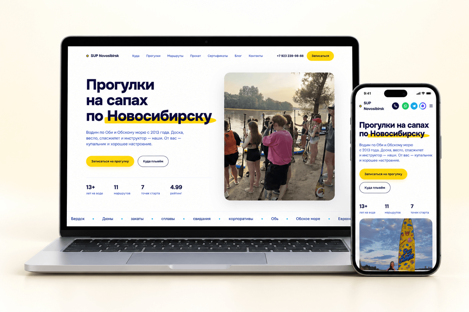
Project at a glance
SUP Novosibirsk runs SUP tours and board rentals in Novosibirsk and the surrounding region. The client wanted to turn the website into an online booking channel: help visitors choose the place, format and time of a tour, and reduce reliance on messaging with a manager. Separate tasks were making the site easy to use on a phone and improving the visibility of the services in search.
- Location catalog with photos, addresses and starting prices
- Tour formats with descriptions and prices
- Buttons to go to booking and pick a time
- Participation terms and answers to common questions
Want the same for your business? Tell us about your task — we’ll propose a solution and estimate the timeline.
From offer to booking
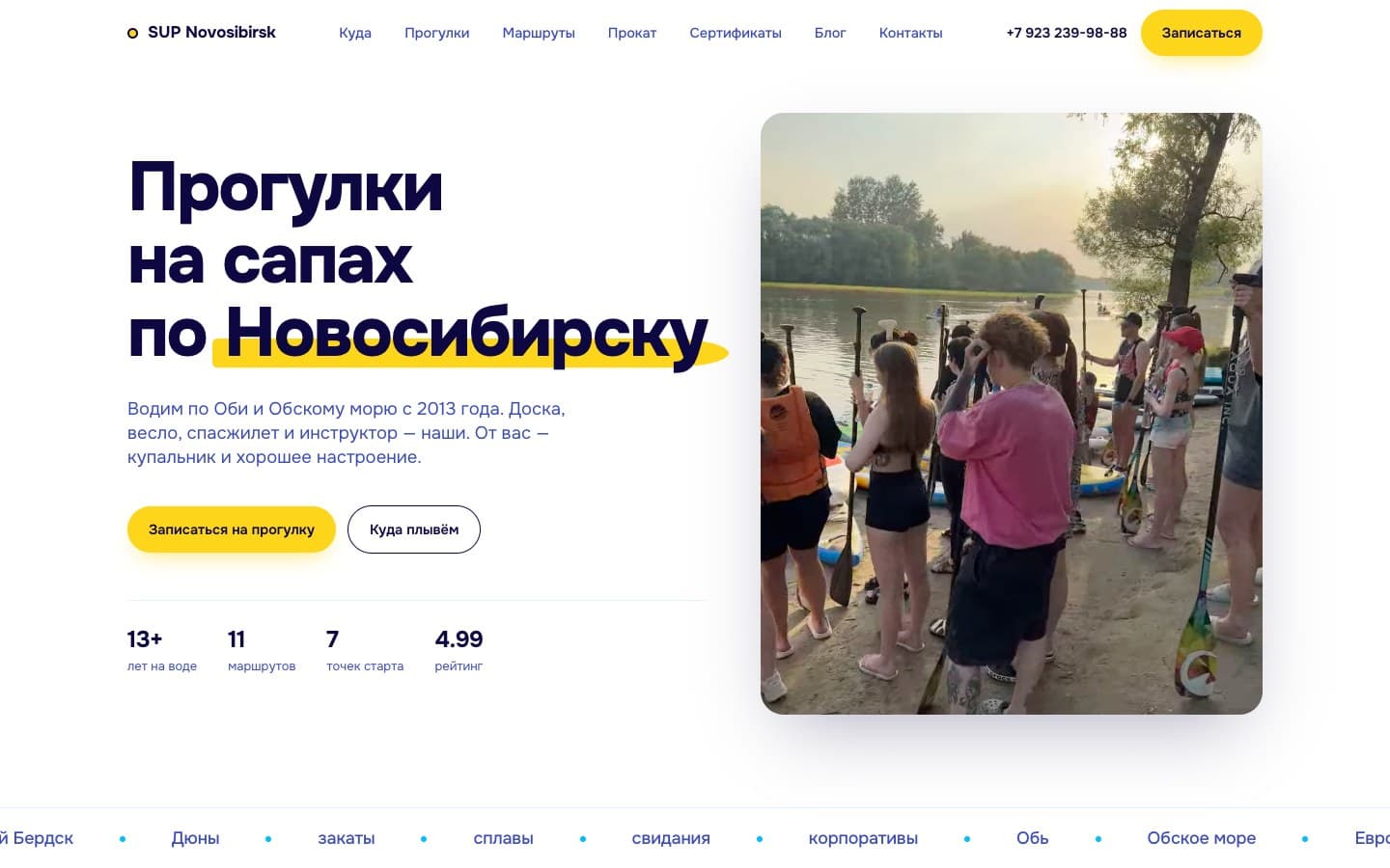
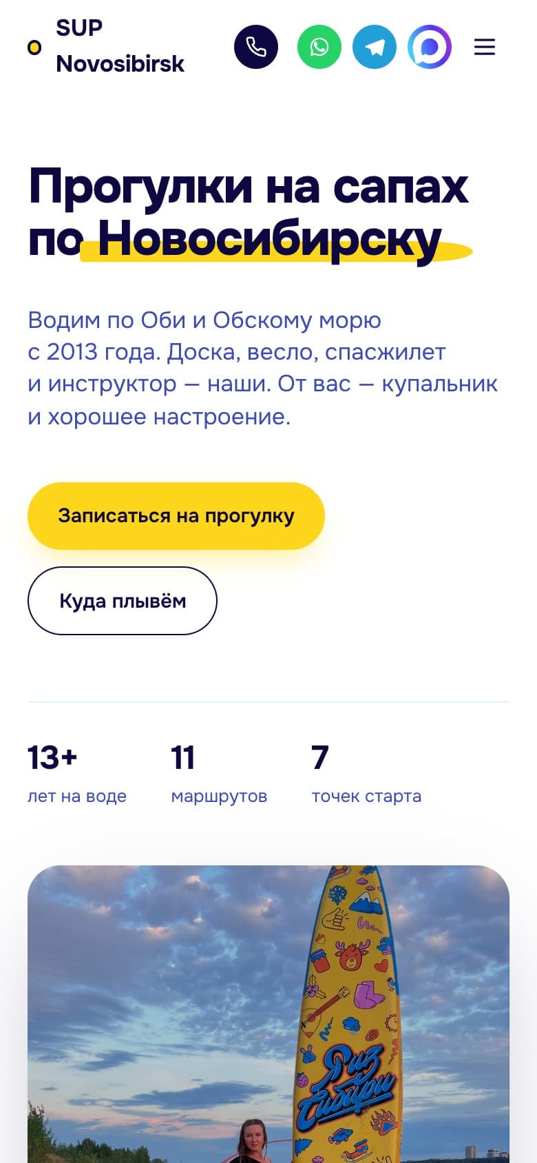
The home page explains right away what the organizer offers and what a tour includes. Visitors learn that the board, paddle and life jacket are provided on site and that an instructor will accompany them on the water.
Next to this are two actions: go to booking or choose a destination first. Further down, the page walks through the path from booking to returning to shore, with photos, an instructors section and answers to common questions. Visitors can study the terms before contacting the organizer.
What the analytics showed
For the redesign, we studied how the old site was structured, its traffic in Yandex Metrica and the bookings report from YClients (online booking system). This data pointed to two areas of work: the entry point to booking and the mobile experience.
The annual report for the Evropeyskaya branch showed that managers had entered 71% of bookings by hand. Meanwhile, from April 12 to May 11, 2026, smartphones accounted for 53% of site visits. We put booking buttons on the home page and adapted the tour offer and the location catalog for phones.
Choosing a place and format
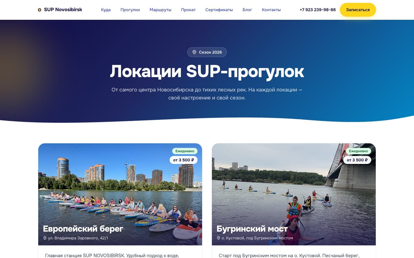
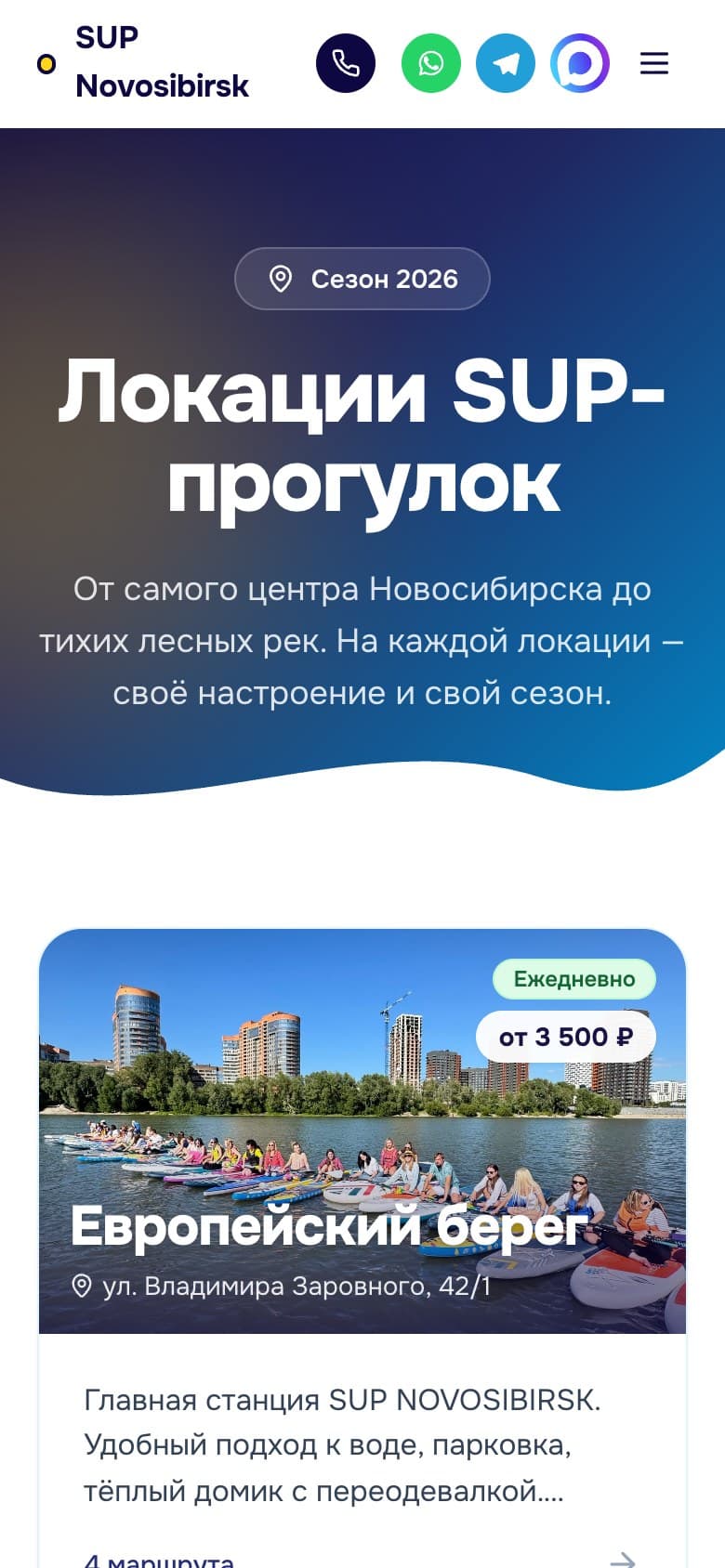
Locations are shown as cards with photos, addresses and starting prices. Visitors can check the launch point and cost in advance, then read about the facilities on shore.
Tour formats have their own list with descriptions and prices. It helps visitors pick an outing for their occasion: a tour for two, a river float or a group event.
A certificate as a gift
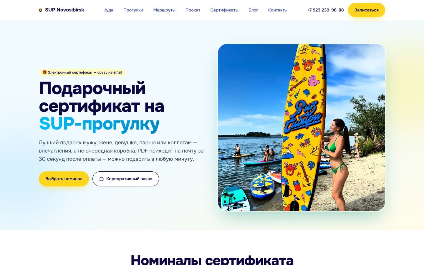
Gift certificates got a separate page. It explains the e-gift format: a PDF arrives by email after payment, so the certificate can be given remotely.
Two requests are kept apart: choosing an amount for a personal gift and placing a corporate order. Both actions are visible on the first screen.
Home page and locations on a phone
On the mobile home page, the blocks follow one another: the offer, tour terms, action buttons and a photo. The large booking button is easy to find, and ways to contact the organizer are in the header.
In the catalog, cards are stacked one under another. The photo, price and address stay together; below them, visitors can read about the amenities at the launch point.
Goals
- Turn the website into an online booking channel for tours
- Make it easier to choose a place, format and time
- Rely less on manual booking through messaging apps
- Improve the mobile experience
- Improve the services’ visibility in search
Target audience
- Beginners with no SUP experience
- Couples and groups of friends
- Corporate event organizers
- Gift certificate buyers
What users need
Job to be done — from situation to outcome
I used to check tour details with the organizer in a messaging app. To plan my outing, I needed to know where we start, how much it costs and what to bring.
I want to find a water outing that fits my occasion and budget, without buying gear and with an instructor by my side.
I know in advance which place and format suit me and how to prepare for the tour. I can come with no experience and no gear of my own.
What’s inside
Location catalog with photos, addresses and starting prices
Tour formats with descriptions and prices
Buttons to go to booking and pick a time
Participation terms and answers to common questions
E-gift certificate page
Mobile versions of the home page and location catalog
How we worked
Audit of the old site
Traffic and booking analysis
Redesign of the home page, location catalog and certificate page
Adapting the home page and catalog for phones
Need a similar project?
Tell us about your task — we’ll estimate the scope, timeline and cost and propose a solution.
Other projects
See all projects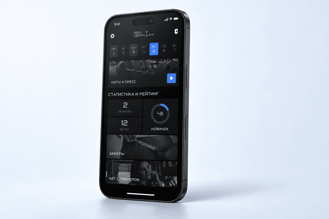
220LBS helps trainees work out on their own with a set program, track their progress and stay in touch with their trainer
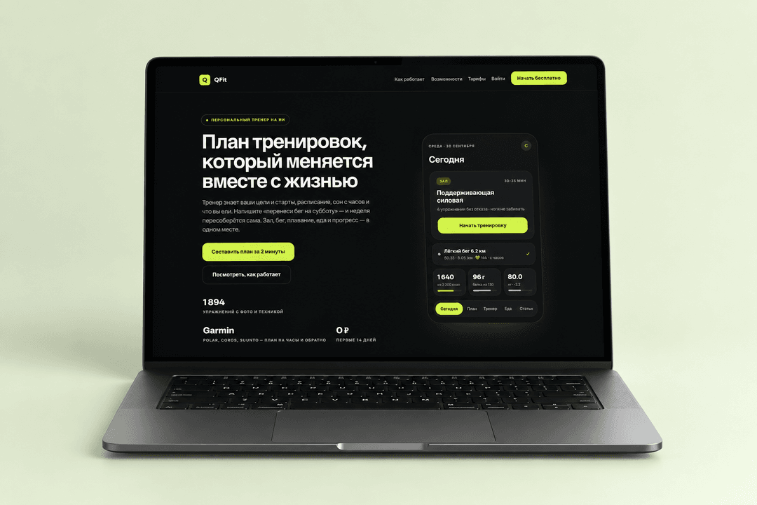
QFit brings workouts, nutrition and progress together in one app, and the AI coach changes the personal plan based on the user’s messages
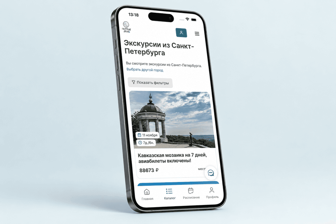
We built an app on top of the Pervye Linii service and refreshed the website design, covering everything from finding a trip to booking and the traveler’s account