


Food ordering app
Client: Gorchitsa
The new design of a shawarma chain’s app combines customizing dishes right in the catalog, delivery and pickup checkout, bonuses and repeat orders
Project at a glance
The Gorchitsa shawarma chain asked us to update the design of its food ordering app. The goal was to make it easier to choose dishes, customize ingredients and check out. The client aimed to reduce ordering to a single step. The new design had to connect the catalog with delivery and pickup, the loyalty program and order tracking — from choosing a dish to rating it and ordering again.
- Search by dishes and ingredients
- Size, sauce and add-on selection in the catalog
- Adding, removing and restoring ingredients
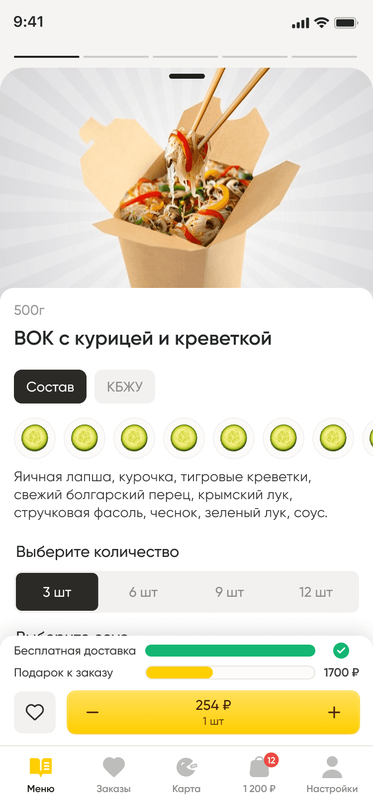
- Ingredients, calories and macros on the dish card
- Reduce the number of steps to choose and order food
- Make it easier to customize dish ingredients
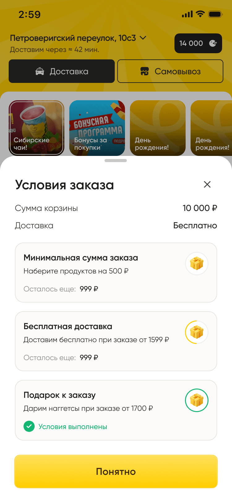
- Show delivery and gift terms before checkout
Want the same for your business? Tell us about your task — we’ll propose a solution and estimate the timeline.
Customizing a dish right in the catalog
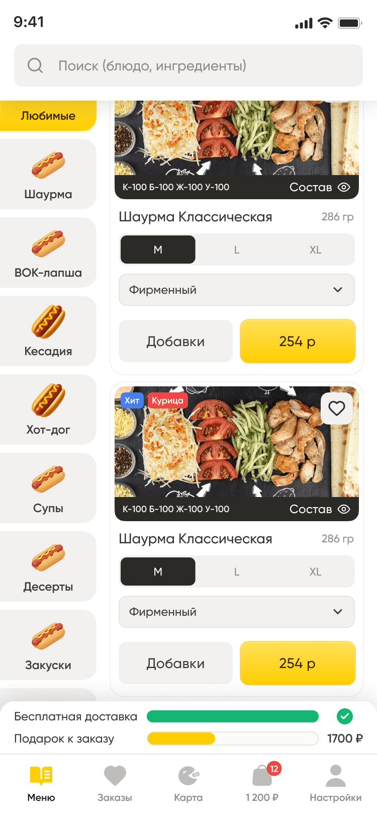
Size, sauce and add-ons can be chosen right in the catalog. The chain offers a wide range of add-ons, so we moved them into a menu: customers don’t have to open a dish card and scroll through it.
Categories are on the left, each with an image above its name. Search covers dishes and ingredients — for those who already know what they want to order.
Ingredients to the customer’s taste
We designed adding, removing and restoring ingredients. A removed ingredient is highlighted in red and gets a “Restore” action: the choice is easy to see, and the customer can change their mind before applying the changes.
The dish card brings together ingredients, calories and macros, and order options. Cart controls are pinned to the bottom, so they stay within reach while the customer views the details.

Delivery and pickup
We worked out both ways to receive an order. For delivery, the customer picks an address on the map or from a list; for pickup, they choose a restaurant. Checkout also covers the time, a different recipient and a comment.
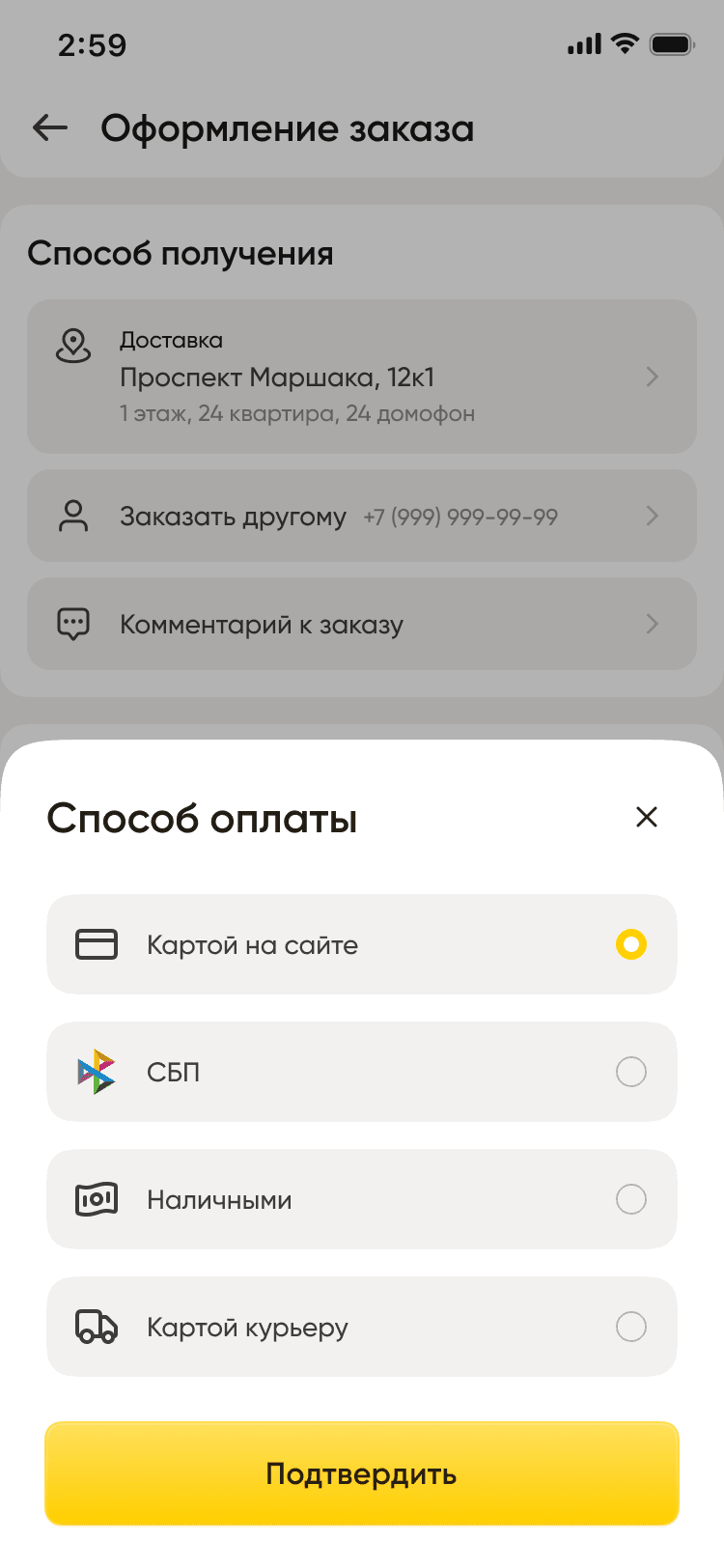
Payment methods are gathered in a separate window: card online, SBP (Russia’s Faster Payments System), cash and card to the courier. The selected option is marked in yellow.
Order terms and tracking
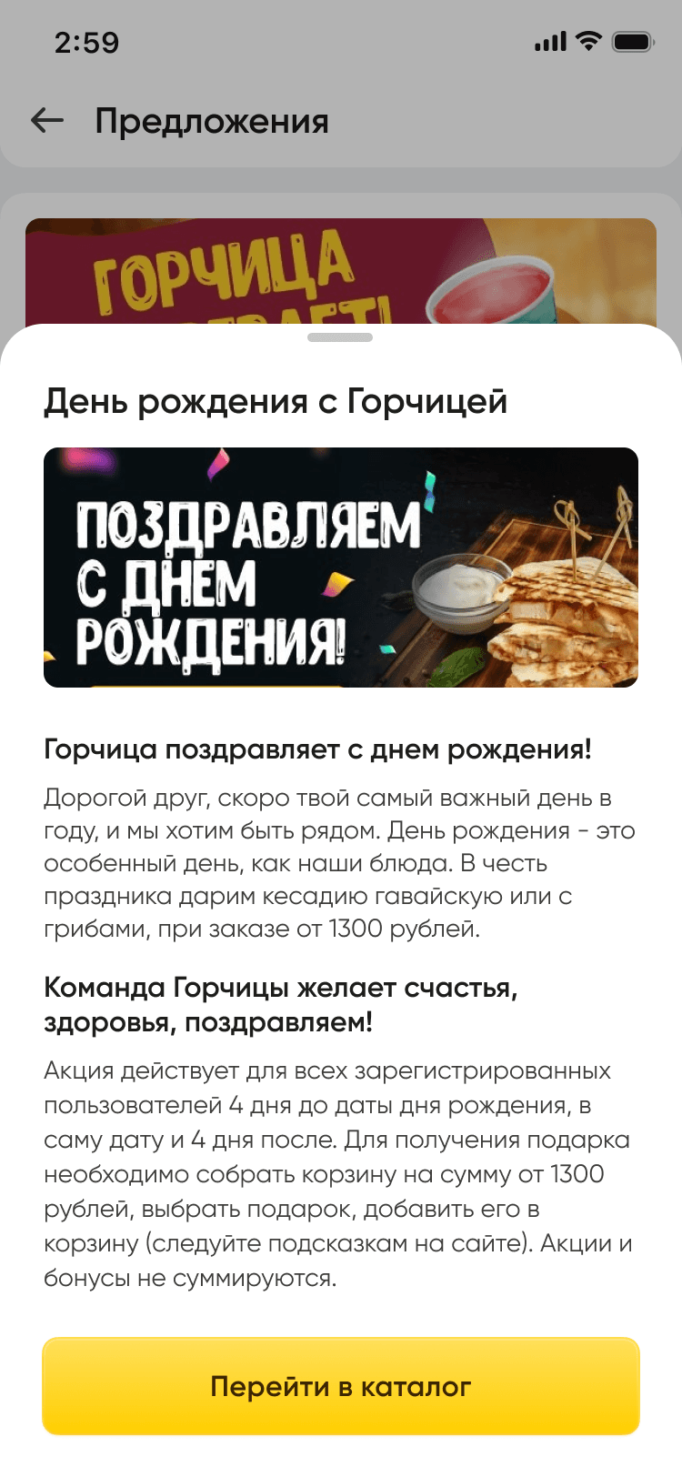
Progress toward free delivery and a gift is shown above the bottom navigation bar. Detailed terms are in a separate window that opens over the catalog, so customers can check them before checkout.
The loyalty program flows link a bonus card with a QR code, the points history and personal offers. At checkout, customers can redeem points and enter a promo code.
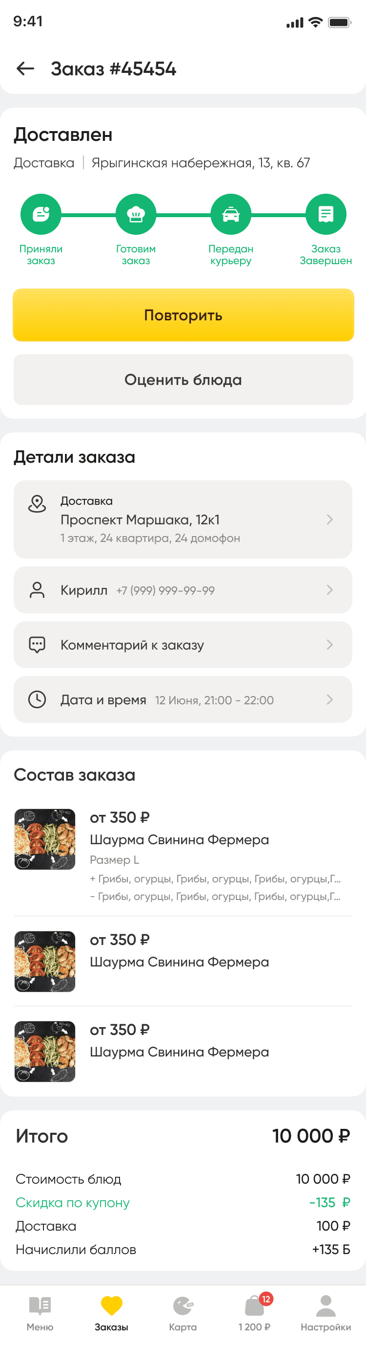
For active orders, we designed statuses and the expected time until the order is ready or delivered. A completed order shows its contents, the total, a repeat-order option and dish ratings.
One style for all of the chain’s interfaces
We updated the visual style: yellow marks the main actions, dark marks selected options, and green marks fulfilled conditions and order statuses. Rounded cards and windows tie the design together.
Based on the new style, we built a component library with colors, standard elements and their states. We prepared ingredient images, including a generated illustration of mushrooms.
The client received a new design for the main ordering flows, plus a set of components and images for future use across the chain’s interfaces.
Target audience
- Chain customers who order food for delivery
- Customers who pick up their order at a restaurant
What users need
Job to be done — from situation to outcome
I order food from Gorchitsa and want my ingredient preferences taken into account without wasting time on extra screens
Quickly order a dish that suits me, know the delivery terms in advance and use the bonuses I have
A dish made the way I like it, clear terms for getting my order and a chance to save on future orders
What’s inside
Search by dishes and ingredients
Size, sauce and add-on selection in the catalog
Adding, removing and restoring ingredients
Ingredients, calories and macros on the dish card
Delivery and pickup checkout
Choice of time, recipient and payment method
Progress toward free delivery and a gift
Bonus card with a QR code and personal offers
Order statuses, repeat orders and dish ratings
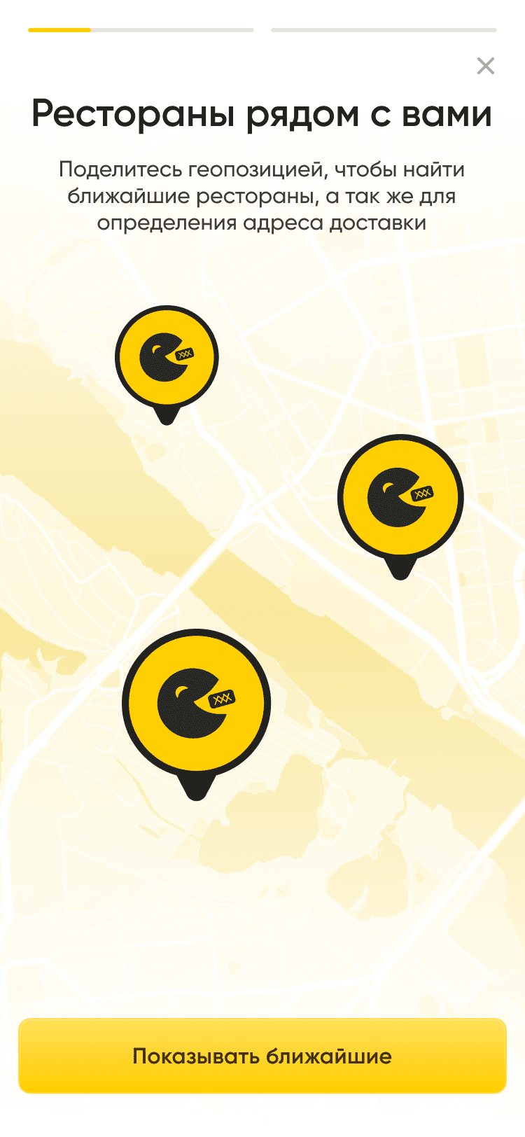
Finding the nearest restaurants by geolocation
How we worked
Working out the catalog and dish customization
Designing checkout and order tracking
Updating the visual style
Preparing the component library and ingredient images
How it looks
Need a similar project?
Tell us about your task — we’ll estimate the scope, timeline and cost and propose a solution.
Other projects
See all projects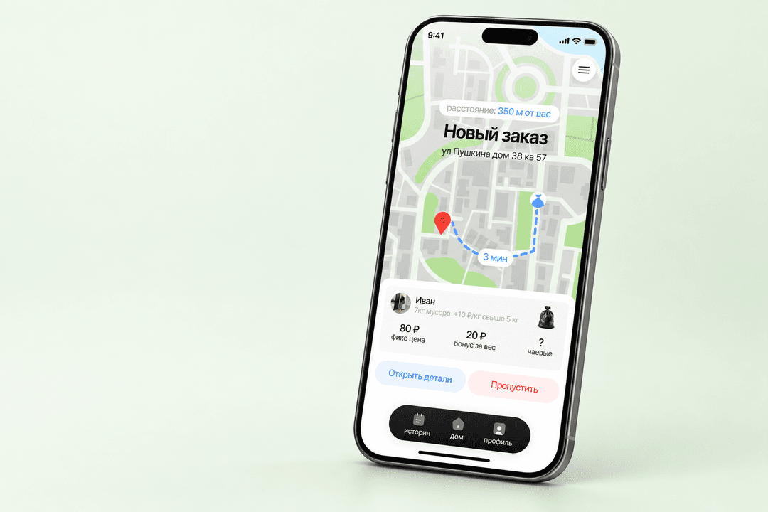
The service lets residents hand off taking out the trash to couriers nearby, and lets the operator manage orders and prepare payouts
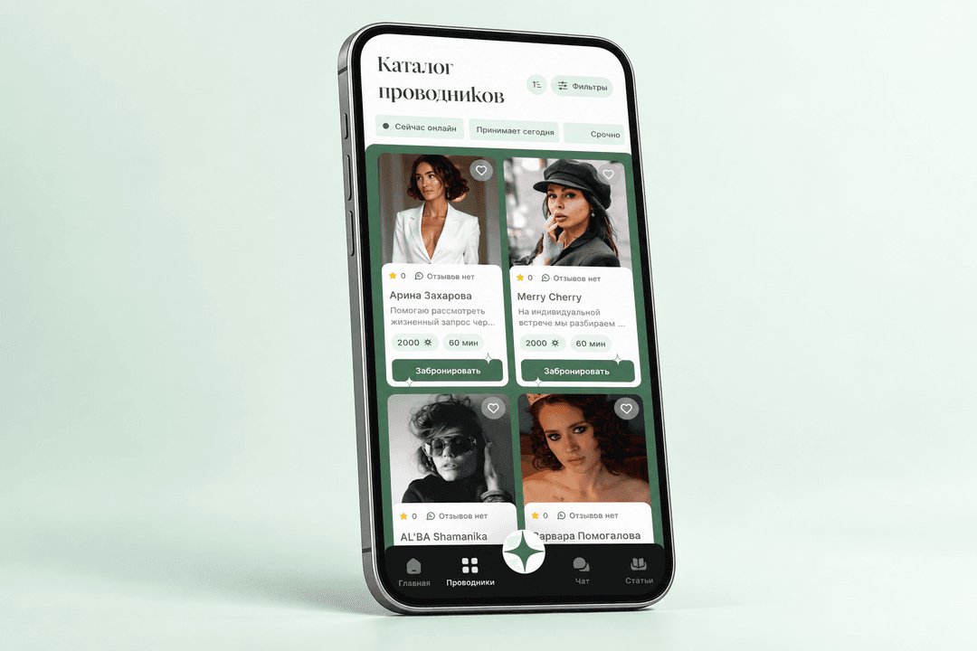
An app for choosing a spiritual practice guide, with detailed practitioner profiles and an article library

The CRM helps the company and its partners manage bankruptcy cases, collect client information and request legal support