


Online perfume store
Client: ParfumElit
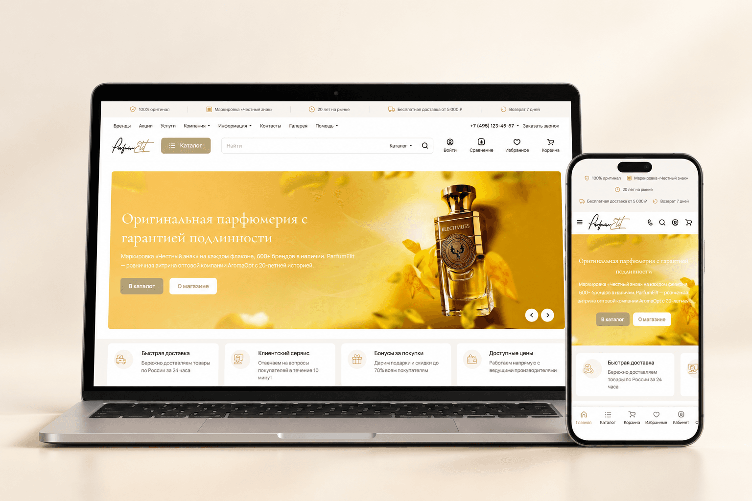
We updated the ParfumElit home page and catalog: made savings on discounted products stand out and presented the range in desktop and mobile versions
Project at a glance
ParfumElit is a Moscow store of niche and selective perfume and the retail storefront of AromaOpt, a wholesale company. The task was to improve the home page, catalog and product page: set visual accents, show discounts more clearly, and make it easier to get to the catalog and choose a bottle size.
- Selections of women’s, men’s and unisex perfume
- Categories, filters and sorting in the catalog
- Prices and availability in product listings
- Separate badge showing the amount saved
Want the same for your business? Tell us about your task — we’ll propose a solution and estimate the timeline.
A home page that introduces the store
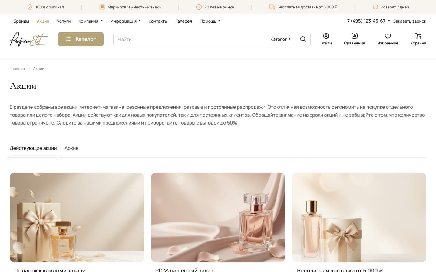
The home page brings together the store’s offers, selections of women’s, men’s and unisex perfume, brands, customer reviews and a magazine. Shoppers can start exploring the range from the category or brand they want.
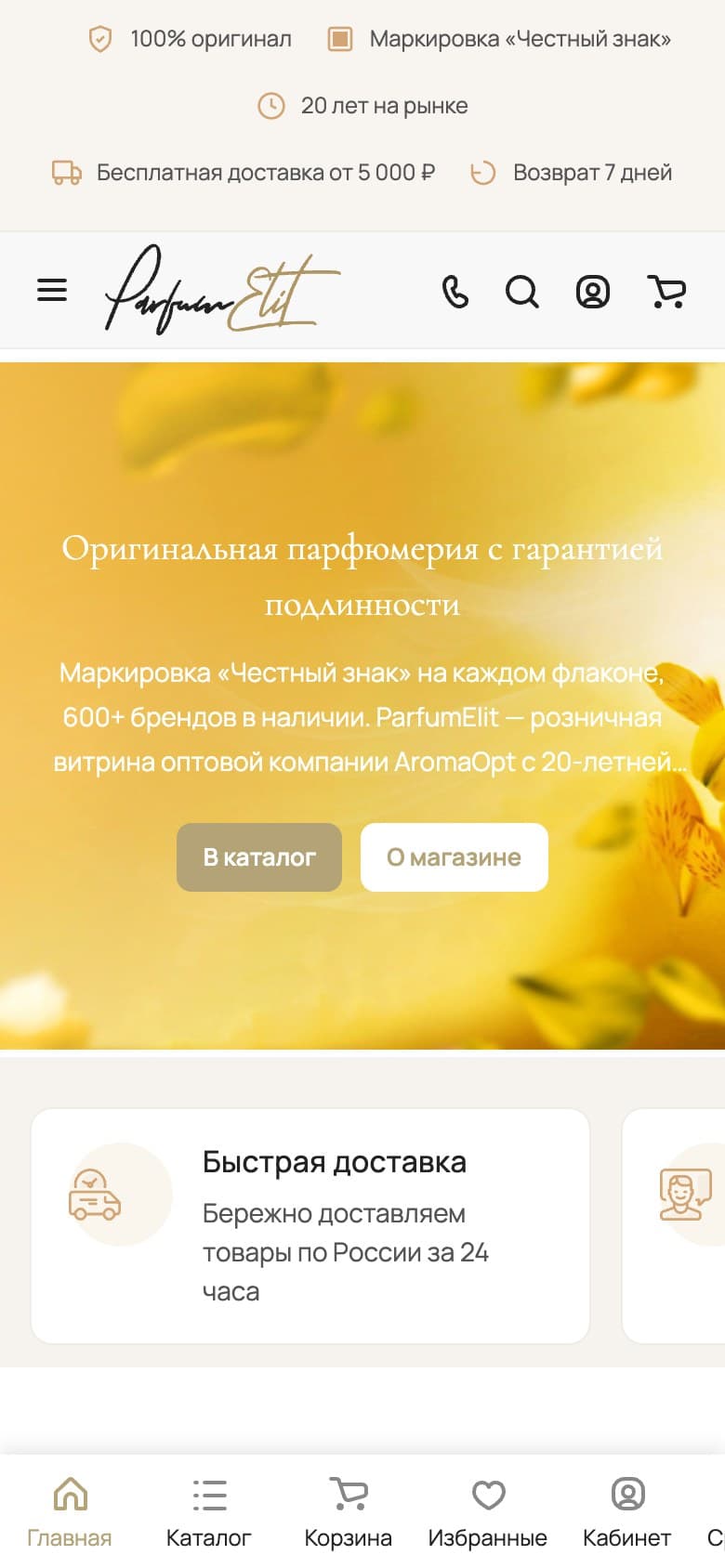
A large yellow banner highlights what the store offers: an authenticity guarantee and the “Chestny Znak” label (Russia’s national product tracking system). Next to the link to the catalog is an “About the store” button, with cards on purchase and service terms below.
Prices and savings in the catalog
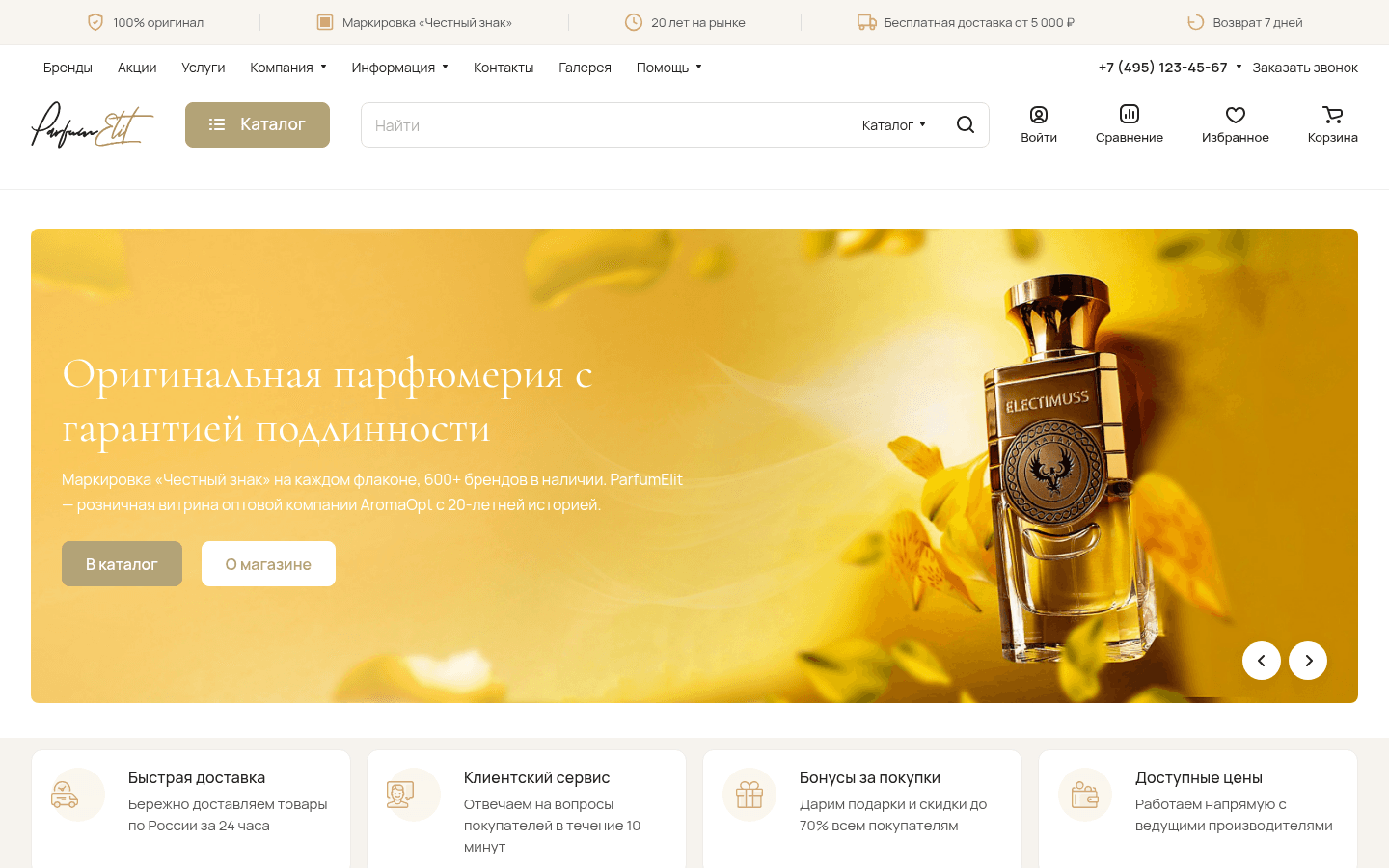
In the desktop catalog, categories and filters are on the left, with sorting above the products. Product cards show photos, prices and availability, so this information is visible right in the listing.
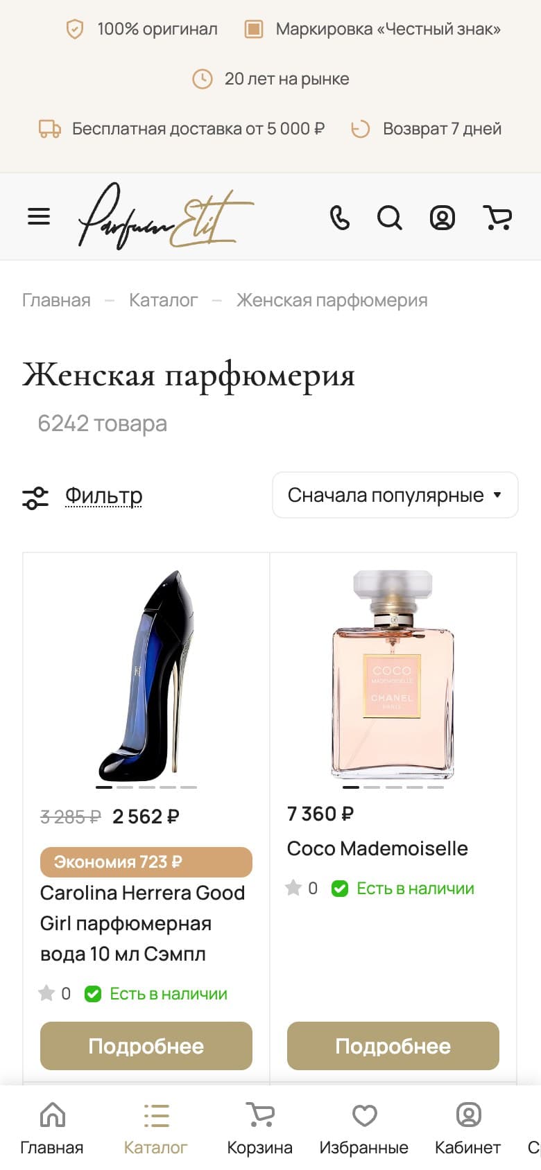
For discounted products, the old and new prices sit side by side. The amount saved is shown in a separate colored badge, so shoppers don’t have to work out the difference.
All offers in one section
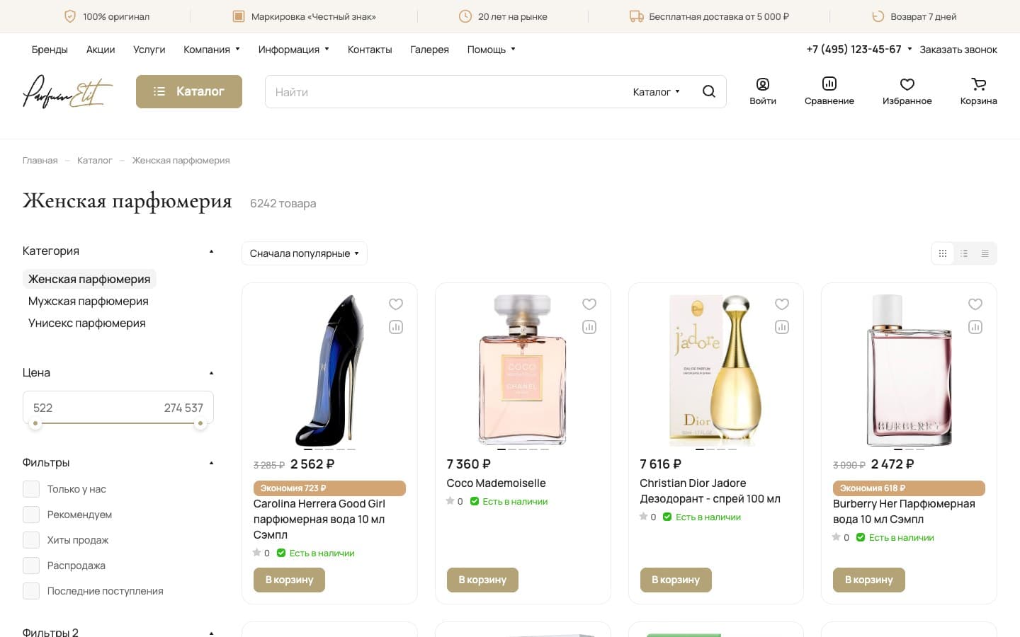
The promotions page collects offers with gifts, a first-order discount and free delivery. Current promotions and the archive are on separate tabs, and each offer has its own card with an image and a title.
The storefront on a mobile screen
The mobile home page keeps the banner with links to the catalog and store information. The header is more compact, and the main sections moved to the bottom navigation bar.
The catalog shows products in two columns. Above the listing are a separate “Filter” button and sorting. The cards keep photos, prices, savings and availability, and a “Details” button leads to product information.
Goals
- Improve the visual hierarchy of the home page, catalog and product page
- Make discounts and the amount saved more visible
- Make it easier to get to the catalog and choose a bottle size
Target audience
- Buyers of niche and selective perfume
- Shoppers who need a consultant’s help to choose a fragrance
What users need
Job to be done — from situation to outcome
I’m choosing niche perfume. Authenticity matters to me, and when I try a new fragrance, I need help choosing.
I want to find the right fragrance with a consultant and buy it from a store that guarantees authenticity.
I can get help choosing and a free sample with my order to try another fragrance.
What’s inside
Selections of women’s, men’s and unisex perfume
Categories, filters and sorting in the catalog
Prices and availability in product listings
Separate badge showing the amount saved
Section with current promotions and an archive
Two-column mobile catalog
Bottom navigation on mobile screens
How we worked
Competitor analysis
Home page and catalog improvements
Mobile versions of the home page and catalog
Need a similar project?
Tell us about your task — we’ll estimate the scope, timeline and cost and propose a solution.
Other projects
See all projects
WildCRM helps sellers on Wildberries and Ozon (Russian marketplaces) make sense of the platforms’ reports and see their business’s financial picture: sales, profit and cost of goods
Panda lets a pet store sell through a mobile app and helps shoppers choose food by ingredients and price

The Entersight website helps store owners explore cloud inventory management and start a free trial